

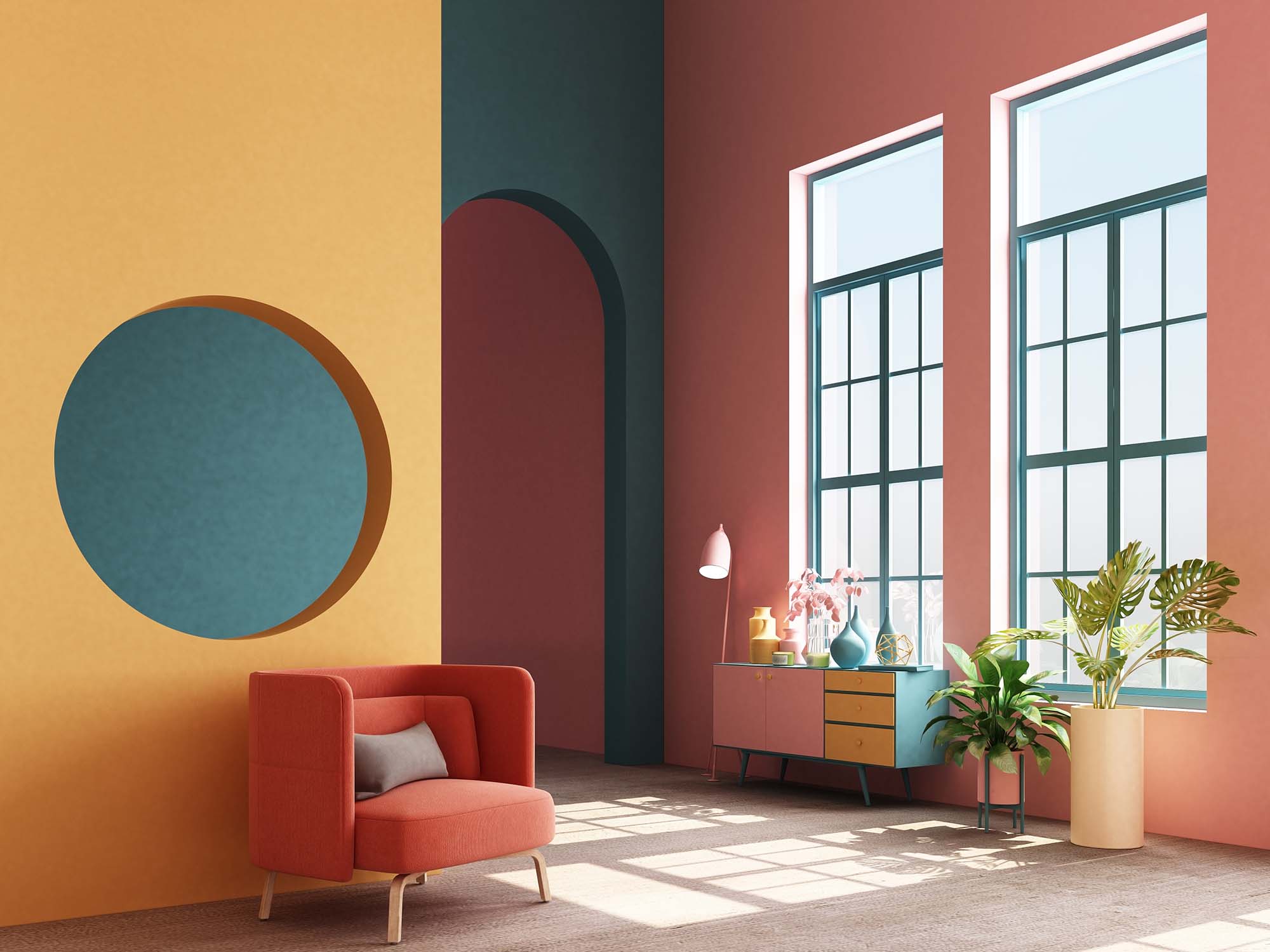
Playful interiors are having a serious moment. More homeowners are moving away from plain white rooms and safe gray finishes, choosing colour, pattern, texture, and personality instead. The challenge is that bold design can go wrong quickly when every surface competes for attention. Flooring is especially important because it covers so much visual space and cannot be swapped out as easily as pillows or paint.
A FunHaus-inspired room should feel energetic, not messy. The right floor can make stripes, colour-drenched walls, patterned upholstery, vintage pieces, and statement lighting feel intentional. The wrong floor can make the same room feel like a showroom clearance corner. The difference comes down to scale, material, colour temperature, and how much movement the floor adds.
Start with the room’s visual volume
Every room has a visual volume, which is the total amount of colour, contrast, pattern, texture, furniture shape, and decor happening at once. If the walls are bold, the furniture is sculptural, and the artwork is oversized, the floor may need to be calmer. If the walls are quiet and the furniture is simple, the floor can carry more personality.
This is where many homeowners make the mistake of treating flooring as a separate style decision. A striped carpet, checkerboard tile, or colourful patterned rug may look exciting on its own, but it has to work with sightlines, doorways, adjoining floors, and natural light. In open-concept homes, a loud floor can travel visually into every connected space, so the pattern needs to be chosen with the whole floor plan in mind.
Stripes can lengthen a room or overwhelm it
Stripes are one of the most useful patterns in flooring because they can change how a room feels. A striped carpet runner on stairs can draw the eye upward and make the staircase feel more designed. A linear tile layout in a narrow powder room can make the room feel longer. A subtle striped area rug over hardwood can add rhythm without permanently committing the whole space to a strong pattern.
The technical detail is contrast. High-contrast stripes create energy but show alignment issues more easily. Low-contrast stripes feel softer and are easier to live with. In carpet, the fibre, pile direction, and pattern repeat all affect how stripes appear after installation. On stairs, pattern centering is critical because even a small shift can look crooked once the runner is installed.
Patterned tile works best when the scale matches the room
Patterned tile is excellent for powder rooms, laundry rooms, mudrooms, and small entries because those rooms can handle more personality. The key is scale. A tiny pattern in a large room can become visually noisy. A very large pattern in a small room can feel awkward if the repeat is cut off at every wall. The layout should be planned before installation, not guessed on site.
Grout colour also changes the result. A matching grout softens the pattern and makes the floor easier on the eye. A contrasting grout outlines every tile, which can be beautiful but much busier. For playful rooms, porcelain or ceramic tile often gives homeowners more practical performance than delicate materials because it can handle moisture, cleaning, and foot traffic while still delivering colour and pattern.
Carpet can be bold without looking dated
Patterned carpet is coming back in a more refined way, especially for bedrooms, stairs, family rooms, and hobby spaces. The new approach is less about heavy floral prints and more about texture, small geometric patterns, loops, tonal designs, and quiet movement. This makes carpet feel designed while still adding softness, warmth, and sound control.
For busy homes, fibre and construction matter as much as the pattern. Nylon is often valued for resilience, while solution-dyed fibres can offer strong stain resistance depending on the product. Patterned carpet can also help disguise footprints and minor everyday marks better than a perfectly plain carpet. The trick is choosing a design that has movement without becoming the only thing the room is about.
Keep one element disciplined
A playful room needs at least one disciplined element. If the flooring is bold, keep the wall colour more controlled. If the walls are colour-drenched, choose a floor with texture rather than a strong pattern. If the furniture is vintage and shapely, a warm hardwood or simple tile may be better than a loud floor. This balance keeps the room expressive instead of exhausting.
Colour temperature is the quiet technical issue. Warm reds, yellows, browns, and creams usually pair better with warm wood, terracotta, natural stone, or muted carpet. Cooler blues, greens, and blacks may work better with neutral tile, deeper wood, or cooler stone looks. Before committing, view samples beside the actual paint, wallpaper, and fabric choices so the undertones do not start arguing.
Fun flooring is not about being random. It is about choosing the right amount of pattern, colour, and texture for the room’s purpose. A powder room can handle more drama than a main hallway. A stair runner needs better pattern control than a loose area rug. A hobby room may benefit from durable, cleanable flooring more than a fragile statement surface.
For homeowners in Chatham, ON, London, ON, and Sarnia, ON, Sacwal Flooring Centres can help compare carpet, hardwood, tile, area rugs, and stone-look options that bring personality without sacrificing performance. Visit Chatham, ON, London, ON, Sarnia, ON, and Windsor, ON to see real samples at full scale, or contact us for help choosing a floor that feels bold, practical, and properly finished.

